Larch Agency
A high-performance marketing agency template featuring bold typography and parallax effects.

The Challenge
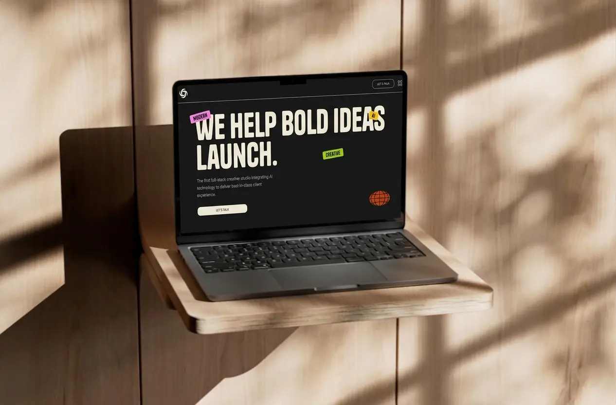
Marketing agencies sell persuasion for a living — so their own website has to be the most persuasive thing they’ve ever made. The problem is that most agency templates feel interchangeable: same layout, same sections, same stock photo hero. Larch Agency was built to break that pattern.
The brief was to create a template that felt bold and editorial without being chaotic, and that could showcase a portfolio in a way that actually stopped visitors from scrolling past. Every interaction had to feel intentional — from the first hover on the navigation to the last click on a project card.
Design Process
The design direction for Larch Agency was: confident, editorial, conversion-focused.
Marketing agencies need to communicate authority immediately. That shaped every decision:
- Fjalla One as the display font — condensed, impactful, impossible to ignore
- Satoshi for body text — modern and readable without competing for attention
- A navigation menu that does double duty: fullscreen overlay with live image previews on hover, turning a functional element into a brand moment
- Parallax scrolling on key images to add depth and keep visitors engaged longer
- A work section with two views — card grid and list — so agencies can choose how to present their portfolio depending on volume and style
The services page got its own dedicated treatment with a work process component, giving agencies a structured way to walk prospects through how they operate.
Technical Decisions
Larch Agency pushed the React islands pattern further than previous templates, with more components requiring genuine client-side interactivity:
| Tool | Why |
|---|---|
| Astro 5 | Static-first core with SSR where needed |
| React 19 | Powers the fullscreen menu, parallax, and hover effects |
| GSAP + Lenis | Scroll-triggered animations and smooth page feel |
| Tailwind CSS v4 | Fast, consistent styling with clean responsive logic |
| Zod + Resend | Validated contact form with reliable email delivery |
The FullscreenMenu.tsx component was the most technically involved piece — it combines GSAP animations, image previews triggered on hover, and full focus trapping for accessibility. Getting all three to work together cleanly required careful state management and animation sequencing. The ParallaxImage.tsx and ItemHoverImagesEffect.tsx components were also built as React islands to keep scroll-linked effects smooth without blocking the main thread.
The Result
Larch Agency ships as a complete, production-ready marketing agency template with:
- Five core pages — Home, Services, Studio, Work, Contact
- Fullscreen navigation menu with image previews on hover
- Parallax image scrolling effects
- Portfolio with card grid and list view
- Individual project detail pages
- Services page with work process component
- Full-screen loading animation
- Newsletter signup in the footer
- FAQ section with accessible accordion
- Automatic sitemap and SEO meta tags
- Legal pages out of the box
The fullscreen menu with hover image previews is consistently the detail that gets the most attention — it transforms a standard navigation into an experience that immediately signals premium quality.
Lessons Learned
Building Larch taught me that the line between animation and distraction is thinner than it looks. Early versions had more aggressive parallax and hover effects across more elements. In testing, it felt overwhelming — impressive for three seconds, exhausting for three minutes.
Restraint is a design decision. Pulling back the parallax to only key sections and reserving the hover image effect for the navigation made the whole template feel more polished, not less.
Focus trapping in the fullscreen menu was also a meaningful accessibility challenge. It’s easy to build an overlay that looks good — it’s harder to make sure keyboard users can navigate it correctly and that screen readers announce it properly.
What I’d Do Differently
A few honest reflections looking back:
- More layout options for the Work page — the card/list toggle is a good start, but a masonry option would open up the template to agencies with more visual-heavy portfolios.
- Animate the loading screen more distinctively — right now it shares a similar pattern with Olmo Studio. Each template should have its own personality from the very first frame.
- Service page depth — the services section would benefit from optional case study links, pricing tiers, or FAQ blocks built in, making it a more complete sales tool rather than just a description page.